
ACCESSIBLE GRAPHIC DESIGN
“Accessibility is solved at the design stage.” To design for accessibility means to be inclusive of the needs of your users. This includes your target users, users outside of your target demographic, users with disabilities, and even users from different cultures and countries.
We can help you get started making your user interface design and visual design more accessible to people with disabilities. Inclusive graphic design is how easily people can use your website. As designers, understanding those needs is the key to crafting better and more accessible experiences for them.
Better Accessible graphic design will improve the UX of your site for not only disabled individuals but for the general public as well. It will also save potential headaches in the future from lawsuits and angry customers.
Below are a few actionable changes that we can make to start enhancing the accessibility of designs.
Our Process
Our WCAG-Friendly, Accessible Graphic Design Process
While it’s easy to get hung up on the visual details, graphic design is, first and foremost, a visual communication method used to convey information with a specific objective. Ease of understanding is the main goal. How designers communicate messages more effectively – colour, layout and typography, etc. – is everything else.
Colours
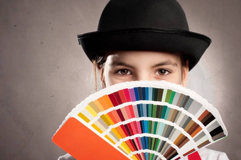
An accessible colour scheme is the most important thing to keep in mind is colour contrast. We will ensure the foreground and background contrast is high enough. Use additional cues such as shapes, icons, and text when using colour to communicate information.
Typography
Good readability and legibility are key to making text accessible.
Legibility refers to how easy it is to recognize characters and tell them apart.
Readability is how easy it is to read the text, and it is related to the typeface and how the designer lays out the type.
Images
Images are great for illustrating concepts and drawing attention. To use images without compromising accessibility, remember to add alternative text descriptions and avoid text within images whenever possible. Don’t embed text within images.
Design Tools
Design for everyone with these accessibility-focused tools
Colour and Contrast impact accessibility in every design. We are highly skilled in working with these accessibility-focused design tools to help you make your designs better for everyone. We address accessibility challenges like colour contrast with these helpful design tools. Each tool has its own unique features and user interface, so feel free to contact us to see which one works best for you. Get a WCAG-friendly Wireframe or UI/UX design for your next project.



FAQ
Accessible Graphic Design — Frequently Asked Questions
What is accessible graphic design?
Accessible graphic design is the practice of creating visuals — colour schemes, typography, layouts and images — so that everyone, including people with visual, cognitive or motor disabilities, can understand and use them. It solves accessibility at the design stage, before development begins.
How do colour and contrast affect accessibility?
Colour contrast is one of the most important factors. We make sure foreground and background contrast meets WCAG 2.2 Level AA, and never rely on colour alone — we add shapes, icons or text so information stays clear to everyone, including colour-blind users.
How does accessible design connect to development?
Great design is only the first step. We carry the same standards into the build through our accessible website development service, and can review or fix existing sites with a website accessibility audit and accessibility remediation.
Do you follow WCAG and Section 508 standards?
Yes. Every accessible graphic design project is measured against WCAG 2.2 Level A and AA and Section 508, so your visuals are both attractive and fully compliant for people who rely on assistive technology.